

What is with the new look?
When Alternatives Incorporated's past branding was developed, the goal was to grab your attention. It achieved that goal. But as time has passed, we have learned from survivors we needed something new. One survivor told us "It immediately takes me to the worst-case scenario." Another said, "It reminds me of being silenced."
For the past several years, the agency has been conducting focus groups with survivors and we have learned so much! They have taught us how damaging and long-lasting the stigma around domestic violence is. Survivors have told us it is more meaningful to focus on what is positive and to provide hope.
Survivors told us they would not approach our booth at a community fair with our old branding because it created feelings of anxiety, fear, stress, and some said it reminded them of a scary movie. This informed our process moving forward.
Through a generous donation from a community member, the agency was able to consult with Harden Digital to discuss what we needed to move away from and where we needed go. There was a focus placed on positivity.
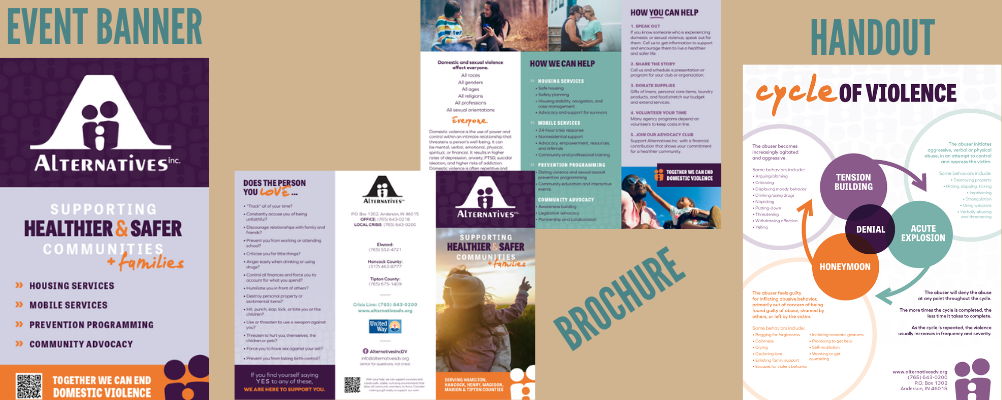
After hearing from us, they designed some preliminary pieces, including a branding toolkit. The colors chosen align with our three awareness topics:
- Domestic violence is purple
- Sexual assault is teal
- Teen dating violence is orange

They selected an array of images focused on people in happy, healthy relationships. The focus is on what survivors can achieve and how Alternatives Incorporated can help them get to a place of peace and happiness. The images have a lot of natural light to focus on the positive. A stark contrast from the darker overtones of the previous imagery.
There is an intentional focus on representing different types of people and relationships because domestic violence can happen to anyone. Survivors reviewing our past branding said they felt like our agency would only help women, which isn't fair because anyone can experience abuse.

Before we finalized the new design, we wanted to hear from survivors. We wanted to know if the changes we made were achieving our goal of being more welcoming and inviting. Here are a few of the things they told us about the new branding and imagery:
- "The colors make it seem a lot happier and more welcoming."
- "It's unity; you are not alone."
- "It looks like more happiness, like it's a better day."
- "A bright future, a better tomorrow, future possibilities—not just a constant reminder of what you have been through...that doesn't make you feel any better."
- "It shows that you can escape this."
We asked if they would approach our booth at a community fair or take our materials now. They said:
- "I'm way more drawn to it."
- "I would be more inclined to approach it."
- "You want to feel like you are coming into an environment like that...that gives you hope."
- "It makes you wanna read it. Makes you wanna be more intrigued."
One survivor spoke about how they would be more inclined to take materials with the new imagery and branding. They wouldn't have before because they would be afraid their abuser would find it and know they were looking for help. With the new branding, they said it would be less likely to grab the abuser's attention if they were to find it because "It could be anything, it's sunshine!" This was important to our process. We want survivors to feel comfortable taking our materials so they can grab them and call for help or assistance in their time of crisis.
Overall, the feedback from survivors and community members has been positive. They have told us:
- "It's empowering."
- "The people are living, it looks like they are happy."
- "You can thrive in this program."
- "It's possible to get there and they can help you."
Through this redesign, Alternatives Incorporated's materials will be more approachable. This will result in more survivors engaging with our agency, taking materials with them, and connecting with Alternatives Incorporated when they need help.
We hope you will join us in the journey—shifting from focusing on the negative, the abuse, and the past; to the positive, the healing, and the future. Look for our new materials throughout the communities we serve.
Thank you to the following who have helped fund the transition to our new look! We appreciate your support.


